Frontend Design Wrapped 🎉 — MyFinance Dev Update

Starting with System Design

The Evolution (What I Had vs. What I Changed)
The Finished Design (So Far)
-
Login/Register
Totally refreshed with new input styles and containers. These now fit the background narrative and feel much more futuristic—so good, they’re almost “fun” to fill out!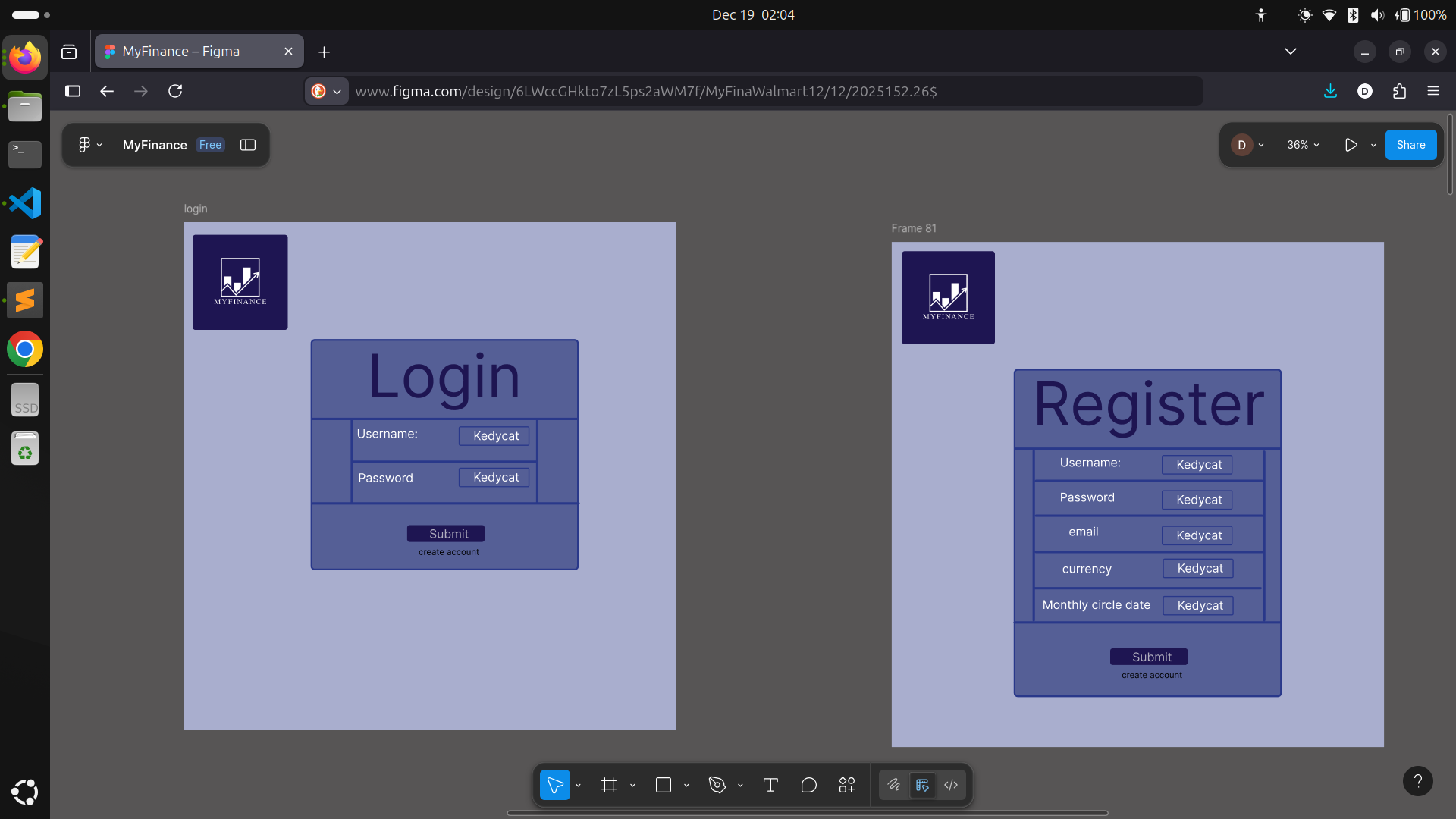
-
Dashboard
Updated data blocks with my current design language. I plopped in new "side" blocks that display investments and miscellaneous spending for the current month—turns out, these were just what the page needed. Recent incomings and outgoings show up in up-to-date tables.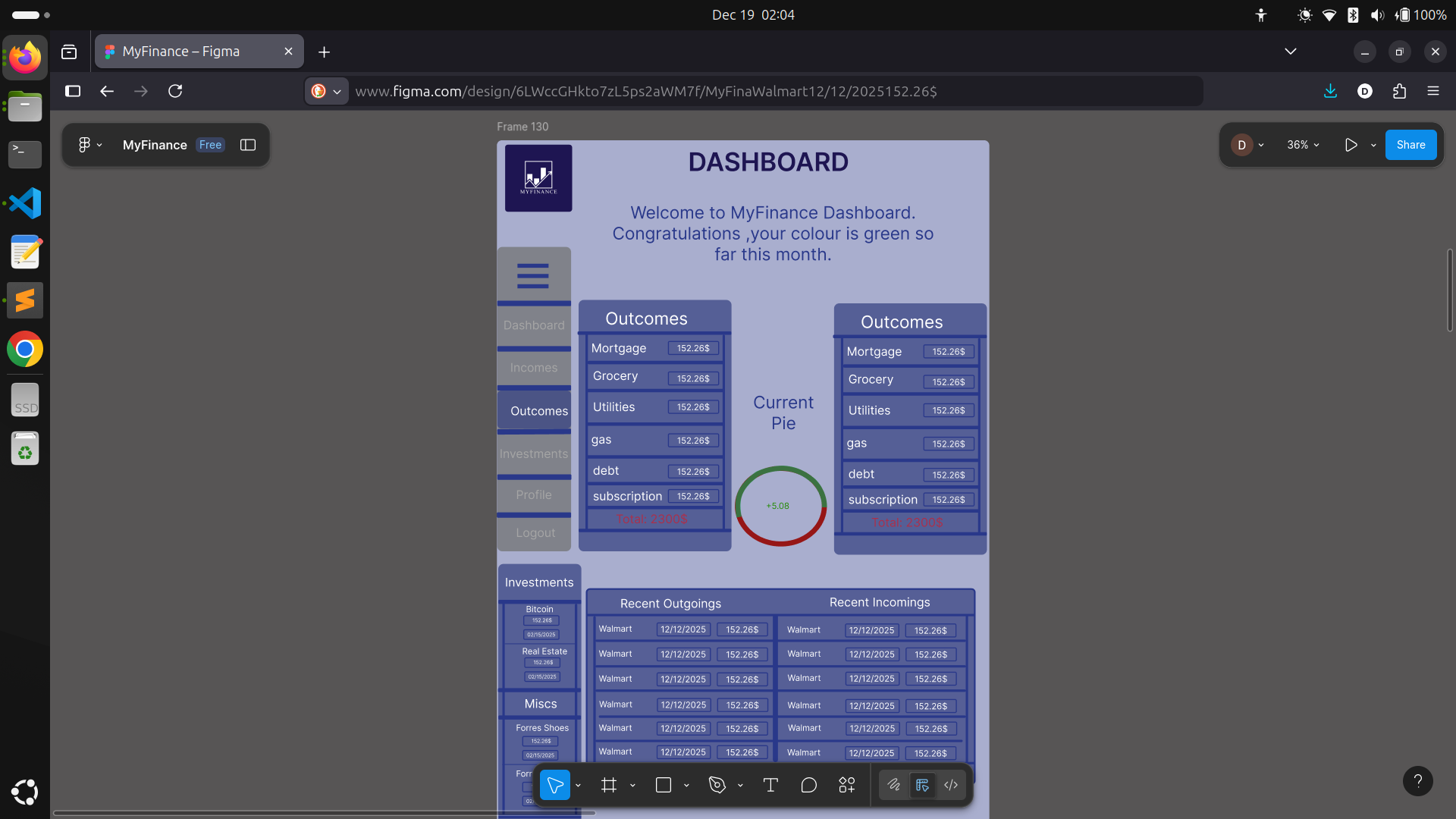
-
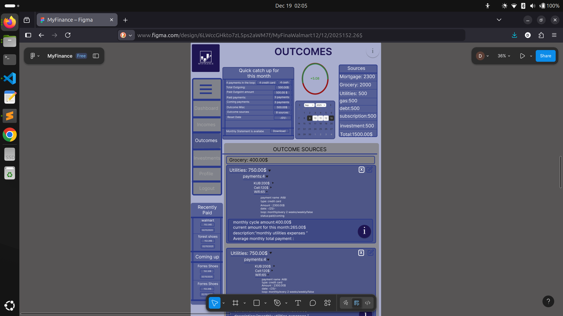
Incomes/Outcomes
These pages are basically the birthplace of the new style. At first, the content was there, but it looked bland. With a new component system and better background, both pages are way cleaner and actually nice to look at, no matter how much data you throw at them.
-
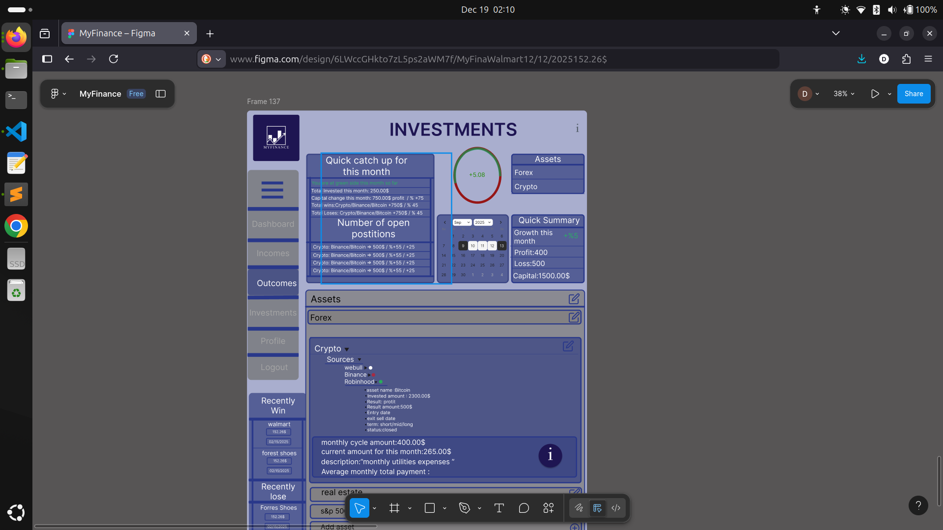
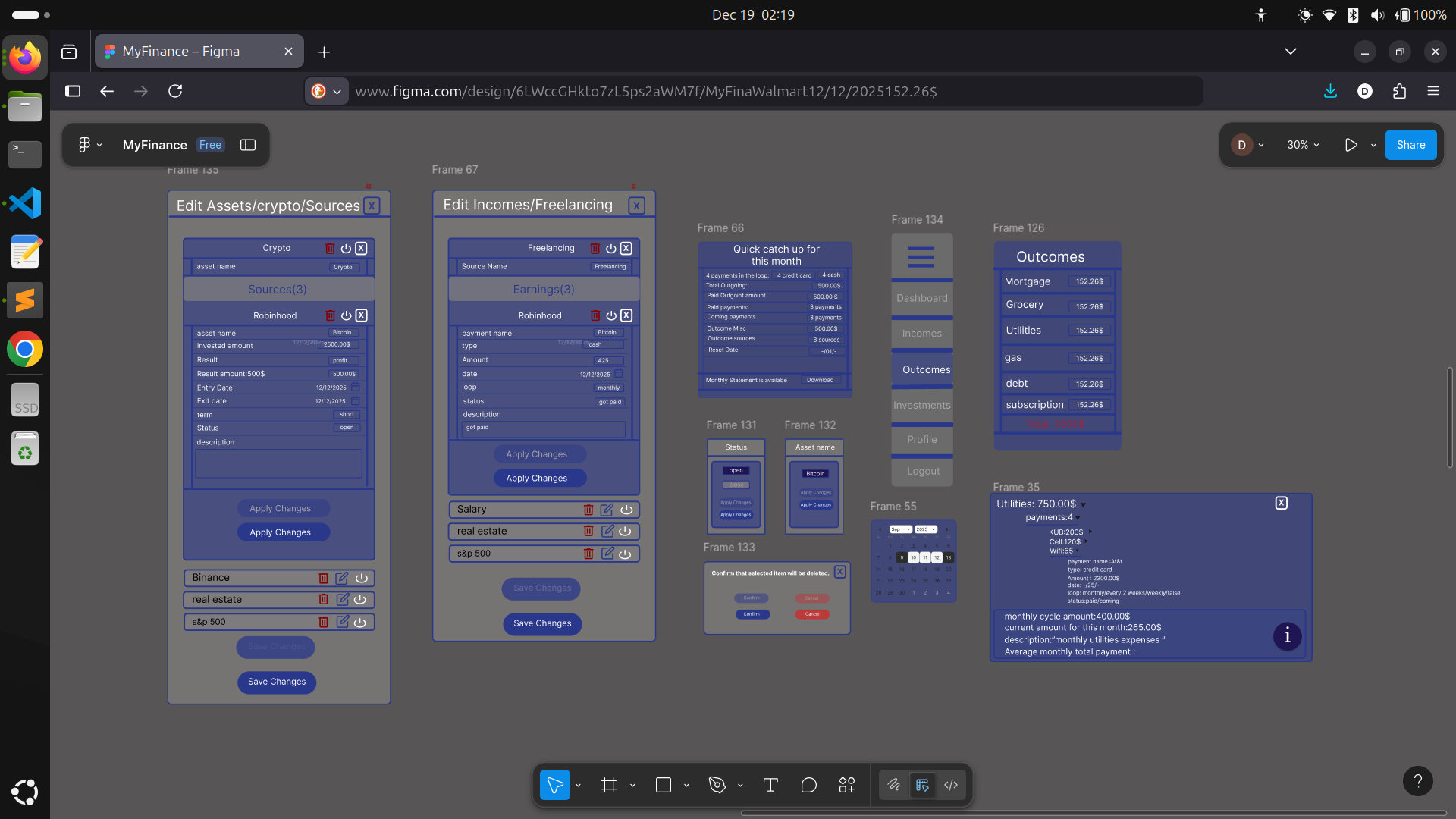
Investment
Here’s where things got really interesting. There’s a LOT more relevant data to surface than I first thought—assets, profit/loss, types, and more. I intentionally kept the scope tight so I wouldn’t overbuild, but re-used small components for new types of info. It’s also where I realized the importance of relational data: investments link to assets, returns, and user activity in ways a pure document database can’t easily handle. I started out building with MongoDB, but the deeper I went, the clearer it became—this project’s structure begs for a relational database. I’m now researching my options:- PostgreSQL: Handles relationships, powerful queries, open source, huge community.
- MySQL: Mature, widespread, great performance, but not as flexible for JSON or modern types.
- Supabase: Postgres-based with instant APIs/auth, but still a bit new for mission-critical stuff.
-
Profile
The simplest page, showing only what I need from the user: username, email (for auth/comms), the reset date for their monthly statement, and base currency for future features.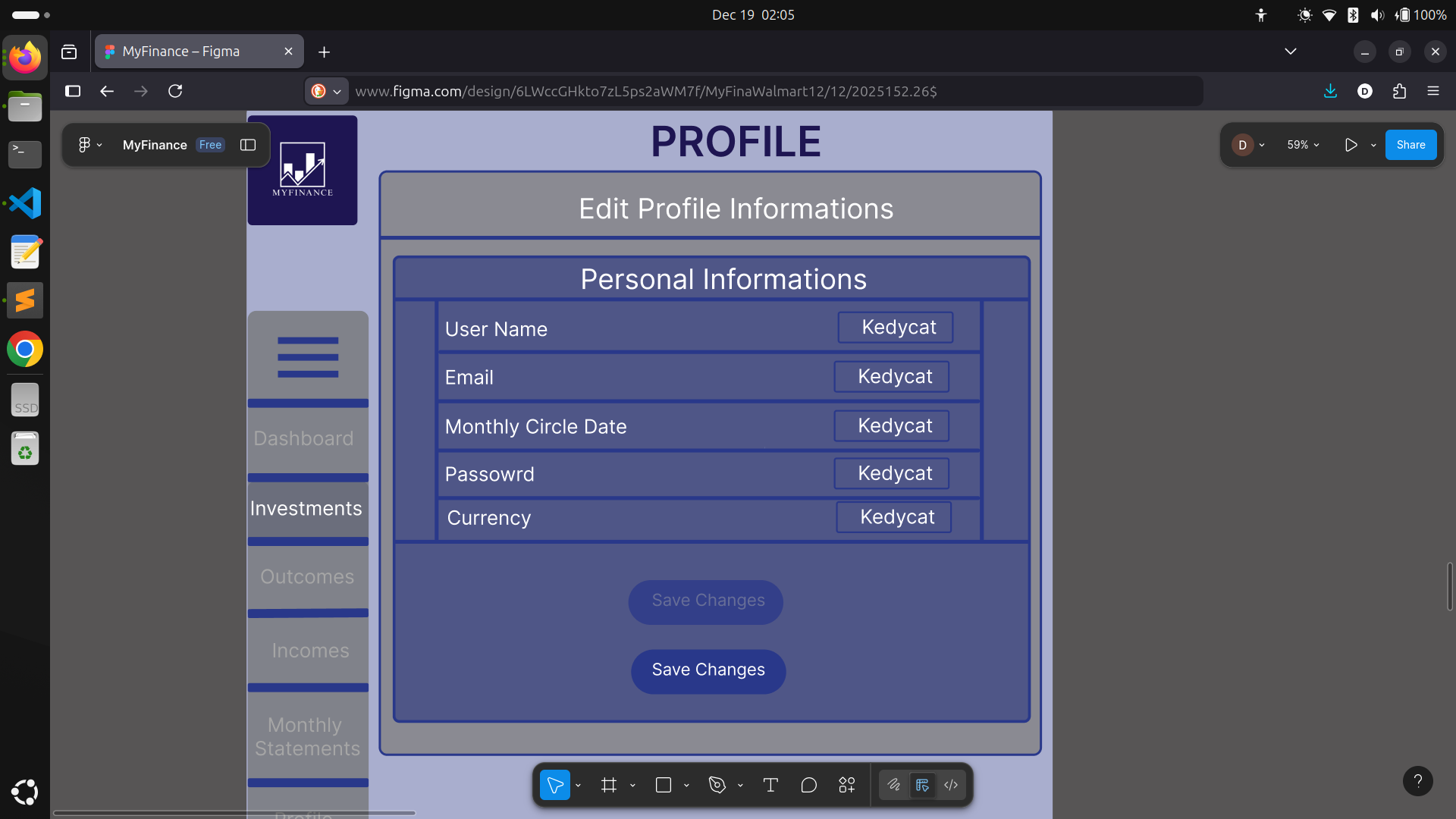
-
Modals for Editing Data:
There’s one main modal for editing, but it’s super reusable—swapping content as needed from page to page, styled for clarity and easy option selection or confirmation. -
A Bunch of Small, Reusable Components:
Core to keeping things DRY and maintainable.
-
Custom Buttons and Input Fields:
Unified style, with color feedback and clear affordances everywhere.
In all honesty, designing for the large screen is now DONE—the structure is locked in, and every part fits just right. All that’s left is implementation, testing, and deployment. It feels wild to write that!
What’s Next?
Thanks so much for following along—every message and bit of feedback motivates me more! Stay tuned for mobile layouts and backend tales soon, and as always, I’d love to hear your thoughts or suggestions.
Stay warm, happy holidays, and keep building! 🚀
#MyFinance #SideProject #FrontendDesign #ProgressUpdate #WebDevelopment #Figma #NextJS #LearningInPublic #RelationalDatabases #FullStack #KeepBuilding