
Confessions of a Code-First Creator (Who Isn't a Designer)
Login & Register: Stealing with Pride
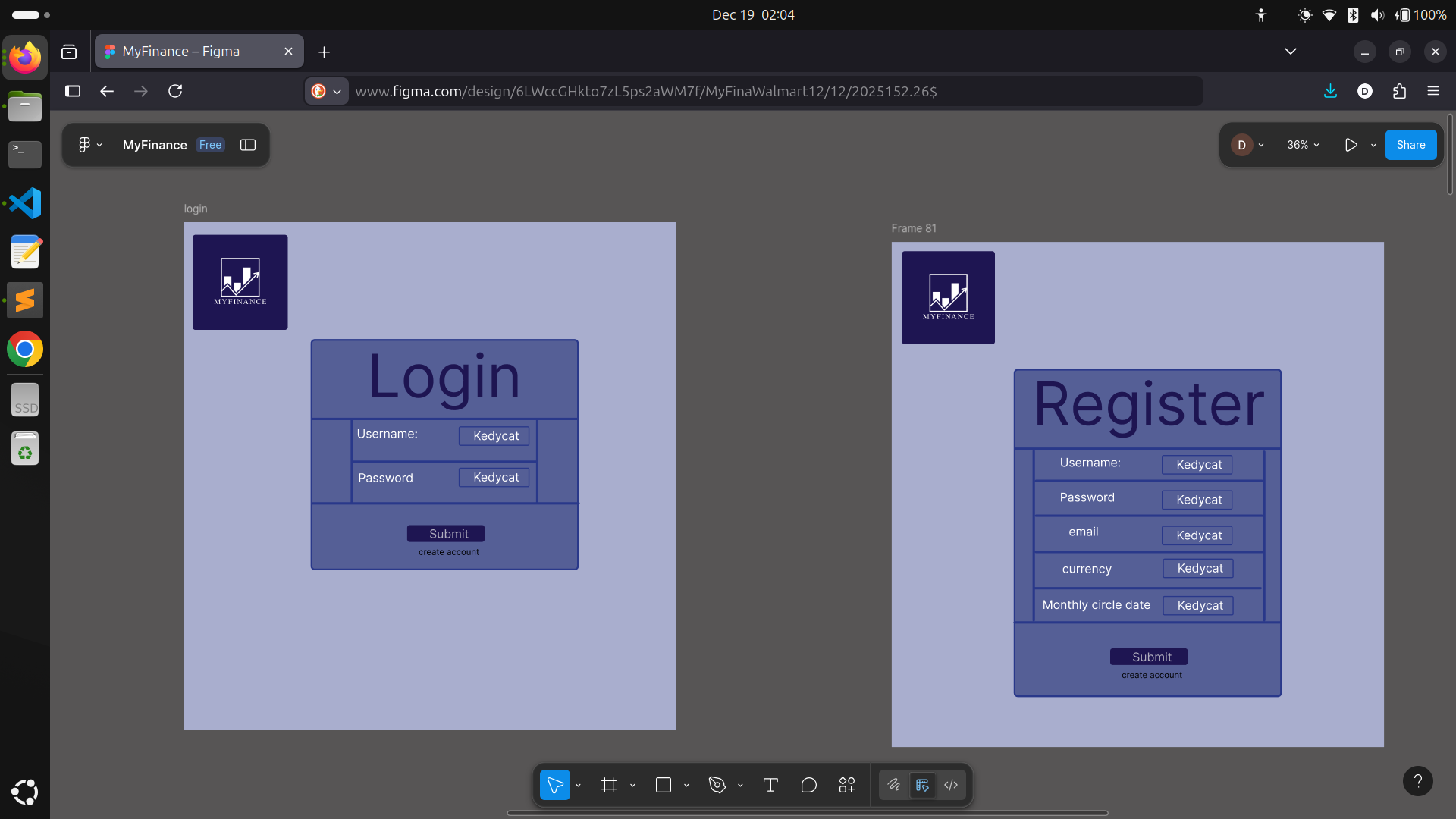 When it came time to design the login and registration screens, I realized I didn’t need to look any further than my own past work. I borrowed heavily from the layouts and user flows I’d built for MealMatch—there’s no shame in reusing your own tried-and-true solutions! It made the whole process much faster and let me focus on refining the user experience instead of reinventing basic forms.
I tweaked the color scheme and spacing to fit the MyFinance brand, but many components—like labeled input fields, feedback messages, and the clean, central card layout—came straight from my previous designs. Adapting what worked well in MealMatch gave me a solid foundation and a little boost of confidence, too. Sometimes the smartest move is to steal from yourself.
When it came time to design the login and registration screens, I realized I didn’t need to look any further than my own past work. I borrowed heavily from the layouts and user flows I’d built for MealMatch—there’s no shame in reusing your own tried-and-true solutions! It made the whole process much faster and let me focus on refining the user experience instead of reinventing basic forms.
I tweaked the color scheme and spacing to fit the MyFinance brand, but many components—like labeled input fields, feedback messages, and the clean, central card layout—came straight from my previous designs. Adapting what worked well in MealMatch gave me a solid foundation and a little boost of confidence, too. Sometimes the smartest move is to steal from yourself.
Dashboard: Where It Starts Feeling Real
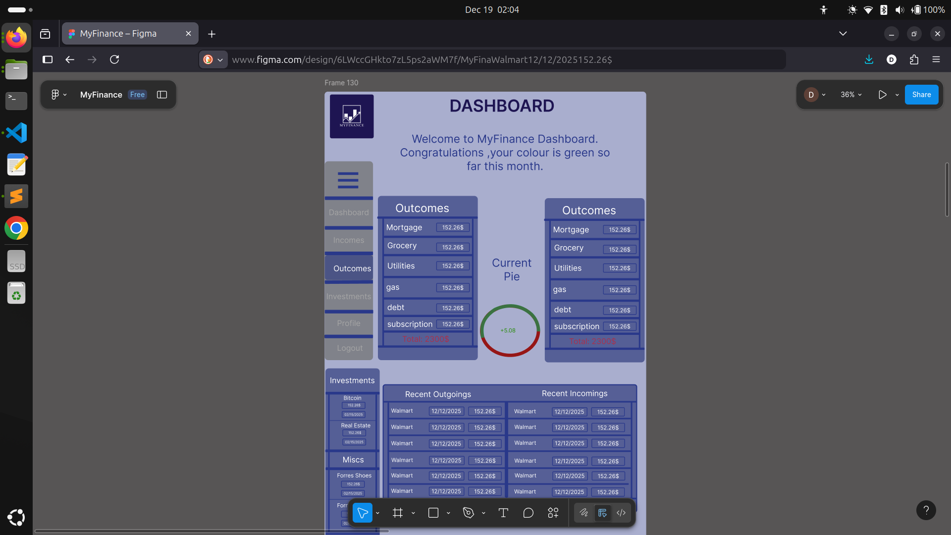 After a couple hours of sketching and tweaking, I had my Dashboard page laid out and surprisingly… I liked the result! Here's the setup:
- Logo stays anchored in the top left—because hey, brand consistency matters!
- Page header reminds you where you are.
- Welcoming message with a splash of color ("Welcome to MyFinance Dashboard. Congratulations, your colour is green so far this month!")—it's a tiny touch, but helps users feel seen and in control.
The Pie Chart Challenge
What I've Learned So Far
- Not being a designer doesn’t mean you can’t design—just expect to iterate more.
- Borrowing trusted layouts and patterns is totally okay, especially for forms.
- Pick a color scheme you love early on, and use it as much as possible. Your app will feel more cohesive.
- Reusable components save you headaches down the line.
- Tackling the hardest parts (architecture and data flow) before visuals makes UI decisions easier.
Next Steps
Parting Thoughts
#ShowYourWork #LearningInPublic #MyFinance #FrontendJourney #DesignStruggles #SideProject #NextJS #TypeScript #BuildingFromScratch